

Blog
15 Stunning Spring Colors to Refresh Your Home Decor (Warning: #3 Is a Game-Changer!)
Spring is finally here, and with it comes a refreshing urge to breathe new life into your home decor. The shift in season has me craving all the beautiful colors that spring has to offer. As flowers bloom and sunlight brightens our days, it’s the perfect time to rethink your space. Whether you want to make a big splash or simply add a few accents, spring colors can work wonders in transforming your home into a vibrant retreat.
If you’re someone who loves interior design or just enjoys a cozy, inviting space, this post is for you. I’ll share 15 stunning spring colors that can uplift your home and keep it feeling fresh and inviting. From soft pastels to bold hues, these colors are not just pretty; they can completely change the atmosphere of your rooms. You’ll find each shade brings its own unique vibe, making it easy to find something that resonates with your style and personality.
What can you expect? This guide will provide you with actionable ideas to refresh your decor with spring colors. You’ll discover how each hue can evoke specific feelings and moods, as well as practical tips for incorporating them into your home. Let’s dive in and explore how these colors can help reinvigorate your space this season!
Key Takeaways
– Spring colors can dramatically change the atmosphere of your home, bringing freshness and warmth.
– Incorporating colors like soft lavender and cheerful sunny yellow can create a serene and joyful environment.
– Bold coral is highlighted as a game-changer, adding a vibrant touch that can redefine your decor.
– Practical tips will guide you on how to use each color, whether through paint, furnishings, or accents.
– Explore how different shades can evoke specific emotions, allowing you to create spaces that feel just right for you.
1. Soft Lavender: The Elegance of Serenity
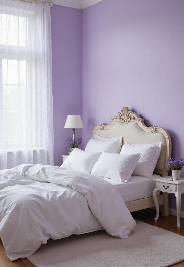
Soft lavender embodies a gentle springtime elegance, infusing spaces with serenity and peace. This calming color harmonizes beautifully with crisp whites, creating a fresh and airy atmosphere, while deep greens provide an enchanting contrast that draws the eye. Imagine soft lavender walls in a cozy bedroom or delicate throw pillows adorning your favorite reading nook to embrace tranquility in your home.
To implement this soothing hue, consider using it in small doses to maintain balance. Look for budget-friendly options like lavender-scented candles to enhance the mood or use thrifted decor pieces to incorporate this color without overspending. Pairing it with natural elements, like wood or metallic accents, can elevate the overall design and connect the space to broader trends in home decor.
Consider these elements to maximize this palette’s potential:
– Use soft lavender as an accent color to avoid overwhelming the space.
– Incorporate metallic accents like gold or silver for sophistication.
– Add lavender-scented candles or potpourri for an immersive experience.
– Avoid overly bright colors to maintain the soothing vibe.
This thoughtful approach creates a calming sanctuary, where textures and muted tones enhance the overall aesthetic.
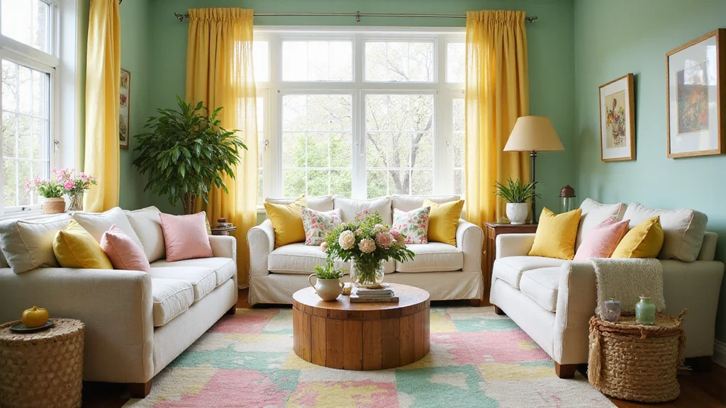
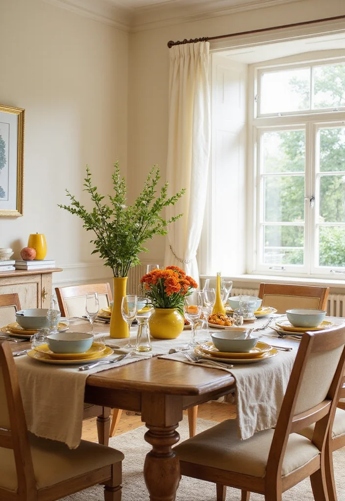
2. Cheerful Sunny Yellow: A Burst of Joy

Sunny yellow is a vibrant spring color that radiates happiness and energy, instantly brightening up any space. This cheerful hue invites positivity, making it ideal for kitchens, playrooms, or dining areas, where joy and liveliness are key. Picture a wall painted in sunny yellow or delightful accents like cushions and artwork that evoke the warmth of sunshine, transforming your home into a joyful retreat.
To effectively use sunny yellow, consider balancing its brightness with soft grays or navy for a modern touch. If painting a large area feels daunting, explore decorative items that feature this lively hue to introduce a splash of color without overwhelming the space. Remember, moderation is essential to maintain a cheerful yet harmonious atmosphere.
Here are some ideas for using sunny yellow:
– Combine with gray or navy to balance its brightness.
– Use yellow art pieces or decorative items if hesitant about painting.
– Keep moderation in mind to avoid overwhelming the space.
– Pair with greenery for a refreshing, outdoor-inspired look.
This balanced approach creates a lively environment where colors dance together, enhancing the overall aesthetic.
3. Bold Coral: The Game-Changer
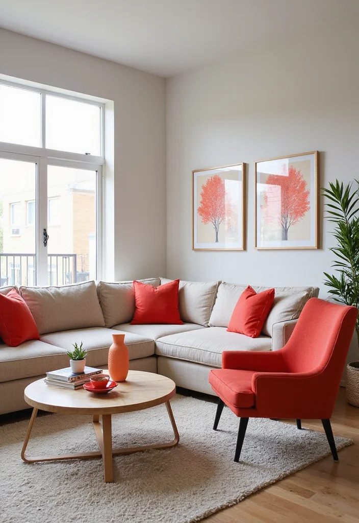
Coral is an exhilarating spring color that brings life and vibrancy to your home. This bold hue, merging the warmth of orange with the tranquility of pink, creates a lively atmosphere that feels both inviting and invigorating. Imagine a coral accent wall in your living space or stunning coral accessories like cushions and artwork that instantly uplift the mood of any room.
To make the most of this game-changing color, consider featuring coral on a statement wall, allowing it to stand out in an otherwise neutral room. Use coral in smaller accessories to add a pop of color without overwhelming the decor. Incorporating coral through florals or art can also introduce depth and texture, breathing new life into your space.
Here are some suggestions for using coral:
– Consider coral for a statement wall in a neutral room.
– Use coral accessories to bring a pop of color without overwhelming.
– Incorporate coral in florals or artwork for added texture.
– Pair with soft blues for a refreshing coastal vibe.
This vibrant approach not only enhances your interior but also fosters a lively environment that feels both trendy and timeless.
4. Refreshing Mint Green: A Breath of Fresh Air
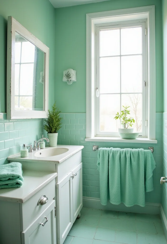
Mint green captures the essence of spring, offering a refreshing and revitalizing vibe. This cool hue brings a sense of renewal to every room, seamlessly fitting into spaces from living areas to bathrooms. When paired with crisp whites or soft woods, mint green creates an inviting and soothing environment that feels both fresh and serene.
To effectively incorporate mint green into your decor, consider using it for accent walls or cabinetry to create a modern, airy look. Small decor elements like vases or cushions can also introduce this refreshing color without taking over the entire space. Remember to balance mint with pastel hues or natural materials for an organic feel that enhances the overall aesthetic.
Enhance the mint experience with these ideas:
– Combine with pastel hues for a soft, romantic palette.
– Use natural materials like wood or stone to elevate the aesthetic.
– Avoid overusing mint in small spaces to prevent a crowded feel.
– Add plants to complement mint green, providing a lively touch.
This thoughtful integration creates a rejuvenating atmosphere, where textures and soft colors harmonize beautifully.
5. Delicate Blush Pink: Soft and Romantic
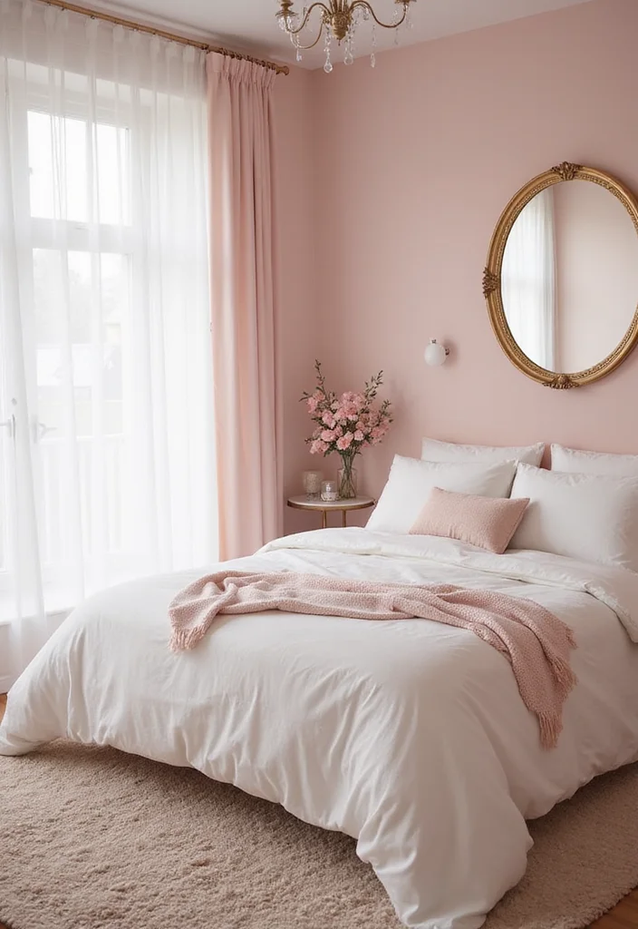
Blush pink is a delightful choice for adding a romantic and soft touch to your decor. This tender hue evokes warmth and comfort, making it perfect for bedrooms and living spaces where you want to foster a cozy atmosphere. Envision blush pink walls or accent pieces like cushions and throws that create an inviting and serene environment for relaxation.
To make the most of blush pink, consider mixing it with grays or whites for an elegant, sophisticated look. Adding gold accents can further elevate the romantic appeal, creating a refined ambiance. Be mindful not to pair blush with overly bright colors, which could disrupt the gentle vibe you’re aiming for.
Here’s how to use blush pink effectively:
– Mix with grays or whites for an elegant look.
– Add gold accents to elevate the overall atmosphere.
– Avoid overly bright colors to maintain the romantic feel.
– Use blush pink in floral arrangements for a lovely spring touch.
This approach creates a timeless and inviting aesthetic, where soft colors and textures work in harmony.
6. Bright Aqua: Vibrant and Energetic
Bright aqua is a lively and invigorating color that can bring a joyful energy to your home. This vibrant shade reflects the essence of clear blue skies and sparkling coastal waters, making it perfect for spaces where you want to feel rejuvenated and alive. Picture bright aqua as a bold accent on walls or furniture, paired with whites and yellows to create a cheerful and refreshing atmosphere.
To effectively use bright aqua, consider incorporating it in larger pieces like furniture or as a statement wall for maximum impact. Pairing aqua with neutral tones helps to ground the vibrant color, creating a balanced look. This hue works particularly well in kitchens and bathrooms, fostering a fresh and clean vibe.
Here are some ways to use bright aqua:
– Incorporate in larger pieces like furniture or walls for a bold statement.
– Use alongside neutral tones to keep the space grounded.
– Perfect for bathrooms and kitchens to create a fresh atmosphere.
– Add playful decor elements like art or cushions for fun.
This vibrant infusion not only energizes your space but also creates a cheerful environment that feels welcoming and bright.
Image credit: Machelle Hutchins on Pinterest
7. Earthy Terracotta: A Grounded Choice
Terracotta is a warm, earthy color that brings a sense of grounding and natural beauty to any space. This hue resembles natural elements like clay and stone, making it an excellent choice for creating a cozy and inviting atmosphere. Imagine terracotta walls or decorative accessories that evoke warmth and comfort, enhancing the overall feeling of your home.
To effectively incorporate terracotta, consider pairing it with greens or whites for an organic and balanced look. Using terracotta pots for plants can further enhance its natural appeal, inviting the outdoors inside. This color works wonderfully in outdoor spaces as well, fostering a deeper connection to nature.
Here are some tips for using terracotta:
– Pair with greens or whites for an organic look.
– Use terracotta pots for plants to enhance its appeal.
– Perfect for outdoor spaces, connecting to nature.
– Introduce lighter shades to balance in larger areas.
This thoughtful approach enriches your decor, where earthy tones and textures create a warm, inviting sanctuary.
Image credit: fiorella giubergia on Pinterest
8. Vibrant Fuchsia: A Bold Statement
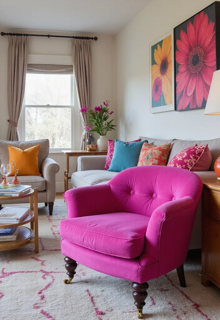
Fuchsia is a daring and bold spring color that can infuse your space with energy and excitement. This vibrant hue stands out beautifully, whether used as an accent or a statement wall, creating a lively and dynamic environment. Picture fuchsia pillows or throws adding a pop of color to neutral furniture, instantly transforming the space into a vibrant haven.
To make the most of fuchsia, consider using it in moderation through accessories or as a focal point in artwork. This color looks striking in well-lit areas, so aim to place it where natural light can enhance its vibrancy. Be careful not to overwhelm a room by limiting its use to a few key spots.
Here are some suggestions for using fuchsia:
– Consider fuchsia pillows or throws for a pop of color.
– Use in artwork or decor pieces for eye-catching focus.
– Place it in bright areas to maximize natural light.
– Limit fuchsia to a few key spots to avoid overwhelming the space.
This balanced approach allows fuchsia to shine, creating an atmosphere filled with excitement and boldness.
Key Trade-offs & Our Top Pick
Option 1: Soft Lavender
– Pros:
– Creates a serene and calming environment.
– Pairs well with both warm and cool tones.
– Cons:
– Might feel too muted in a very bright room.
– May not appeal to those who prefer bolder colors.
– Best for: Bedrooms or reading nooks where tranquility is desired.
Option 2: Cheerful Sunny Yellow
– Pros:
– Instantly brightens up any room.
– Evokes feelings of happiness and warmth.
– Cons:
– Can be overwhelming if overused.
– Might clash with some furniture colors.
– Best for: Kitchens or dining areas where energy is key.
Option 3: Bold Coral
– Pros:
– Adds a lively touch to any space.
– Works beautifully with neutrals and whites.
– Cons:
– May not suit everyone’s taste.
– Can become too dominant if used excessively.
– Best for: Living rooms or accent walls for a striking look.
Option 4: Refreshing Mint Green
– Pros:
– Feels fresh and invigorating.
– Pairs well with natural materials like wood.
– Cons:
– Might be too light for some preferences.
– Can appear washed out in dark spaces.
– Best for: Bathrooms or home offices where a refreshing vibe is needed.
Option 5: Earthy Terracotta
– Pros:
– Provides a warm, grounded atmosphere.
– Complements earthy tones and textures.
– Cons:
– Can feel heavy in very small rooms.
– Not as bright or light as other options.
– Best for: Cozy reading areas or rustic-themed spaces.
Expert Recommendation:
Best Overall: Bold Coral
Bold Coral stands out as the best choice for most people looking to refresh their home decor. Its vibrancy can breathe life into any room, and it combines well with a variety of styles and colors. This option not only offers great value for your money but also brings versatility that can adapt to seasonal changes. Whether you’re redecorating or just adding accents, Coral shines in its potential to transform spaces without overwhelming them.
Why We Picked This:
While Bold Coral is our top pick, those who prefer softer tones might lean towards Soft Lavender for its calming qualities. On the other hand, fans of brightness may opt for Cheerful Sunny Yellow, which can fill spaces with joy. Consider your personal style and how each color makes you feel when making your selection!
9. Soothing Sky Blue: Calm and Comfortable
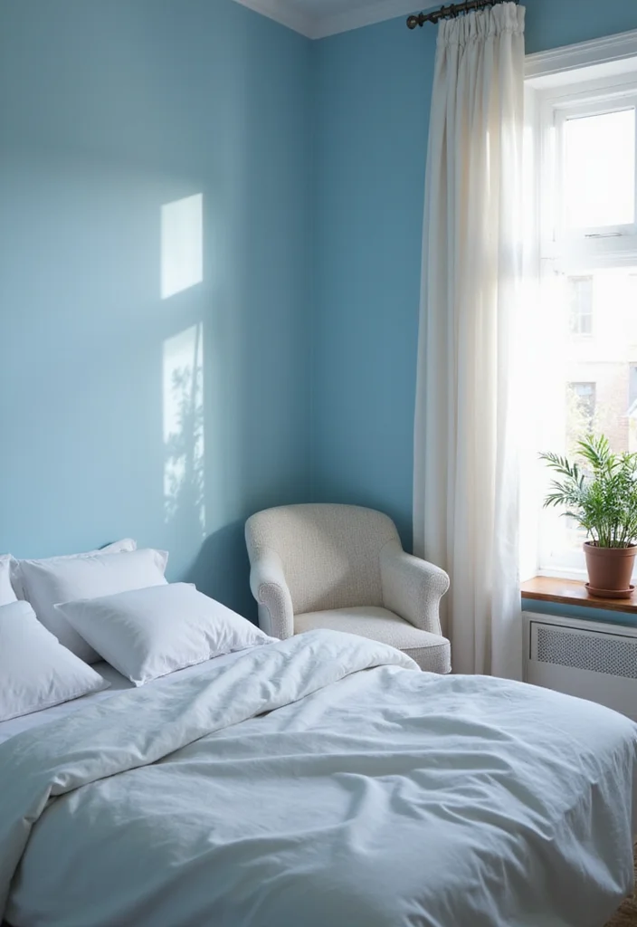
Sky blue evokes the feeling of clear spring skies, making it an ideal choice for serene and calming spaces. This gentle color works beautifully in bedrooms, nurseries, or any area where relaxation is key. Envision sky blue walls complemented by soft whites and earthy tones, creating a light and airy environment that invites peace and tranquility.
To effectively use sky blue, consider painting it on walls for a calming backdrop or incorporating it through decorative items like pillows or artwork. This color pairs well with muted yellows or greens for a fresh and harmonious look. Balancing sky blue with darker shades can also create a grounded palette while enhancing its soothing qualities.
Here are some tips for using sky blue:
– Try it on walls for a soothing backdrop.
– Incorporate through artwork or decorative items.
– Combine with muted yellows or greens for a fresh look.
– Balance with darker colors to ground the palette.
This approach fosters a serene and comfortable atmosphere, where gentle colors and textures work together beautifully.
10. Earthy Sage: Natural and Tranquil
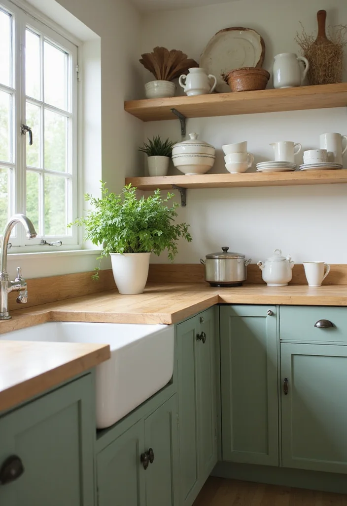
Sage green is a lovely spring color that beautifully connects your home to nature. This muted hue is both calming and sophisticated, making it perfect for living rooms or kitchens, where a serene vibe is desired. Imagine sage green cabinetry paired with warm woods or soft creams, creating an inviting and harmonious atmosphere that feels grounded and tranquil.
To incorporate sage green, consider using it on cabinetry for a modern touch or accessorizing with natural wood elements to enhance its earthy feel. Sage also works wonderfully with floral patterns and textures, adding depth to your decor. Balancing sage with darker colors like navy can create a sophisticated contrast that elevates the overall design.
Here are some ideas for incorporating sage green:
– Use on cabinetry for a fresh, modern look.
– Accessorize with natural wood elements to enhance its feel.
– Pair with floral patterns for a layered design.
– Balance with darker colors like navy for contrast.
This thoughtful integration creates a tranquil environment where colors and textures harmonize beautifully.
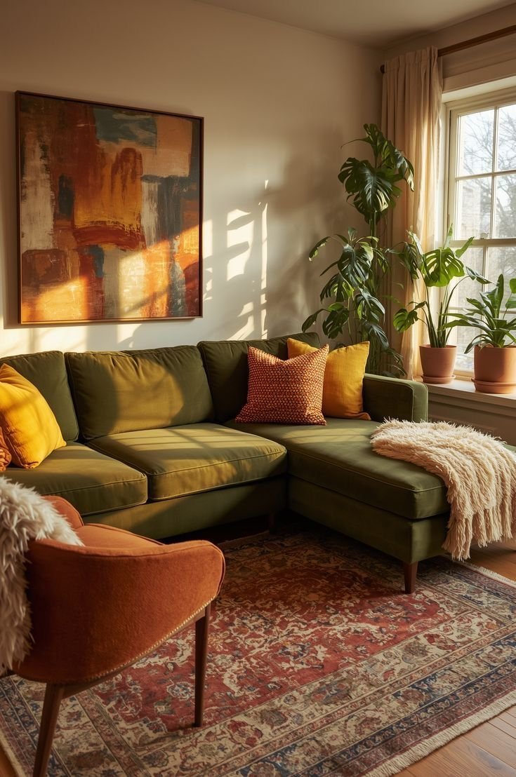
11. Playful Peach: Fun and Inviting
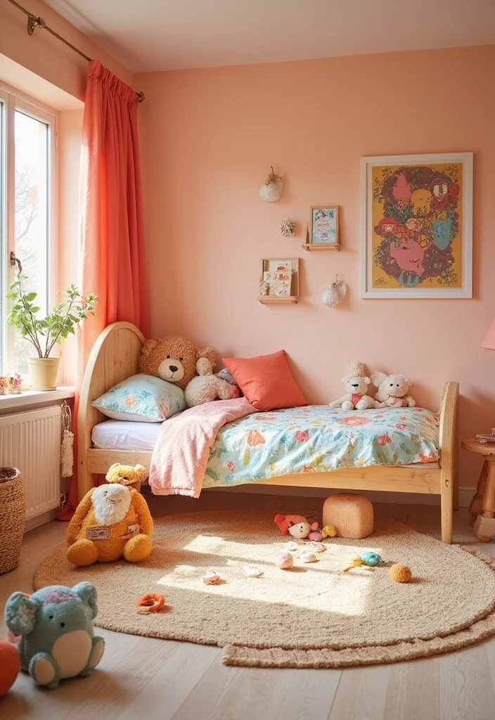
Peach is a playful and inviting spring color that embodies warmth and friendliness. This cheerful hue can brighten up any room, making it an excellent choice for living areas or children’s spaces where joy is essential. Imagine peach accents in throw pillows or rugs that create a cheerful and lively atmosphere, enhancing the overall vibe of your home.
To use peach effectively, consider introducing it through small accents that bring warmth without overwhelming the space. Combining peach with soft grays creates a contemporary balance that feels fresh and inviting. Peach-hued artwork can also add character to your walls, further enhancing the playful ambiance.
Here are some tips for using peach:
– Use peach accents in throw pillows or rugs for warmth.
– Combine with soft grays for a balanced look.
– Consider peach-hued artwork for character.
– Be cautious with darker shades to maintain brightness.
This approach fosters a fun and inviting environment, where playful colors and textures come together beautifully.
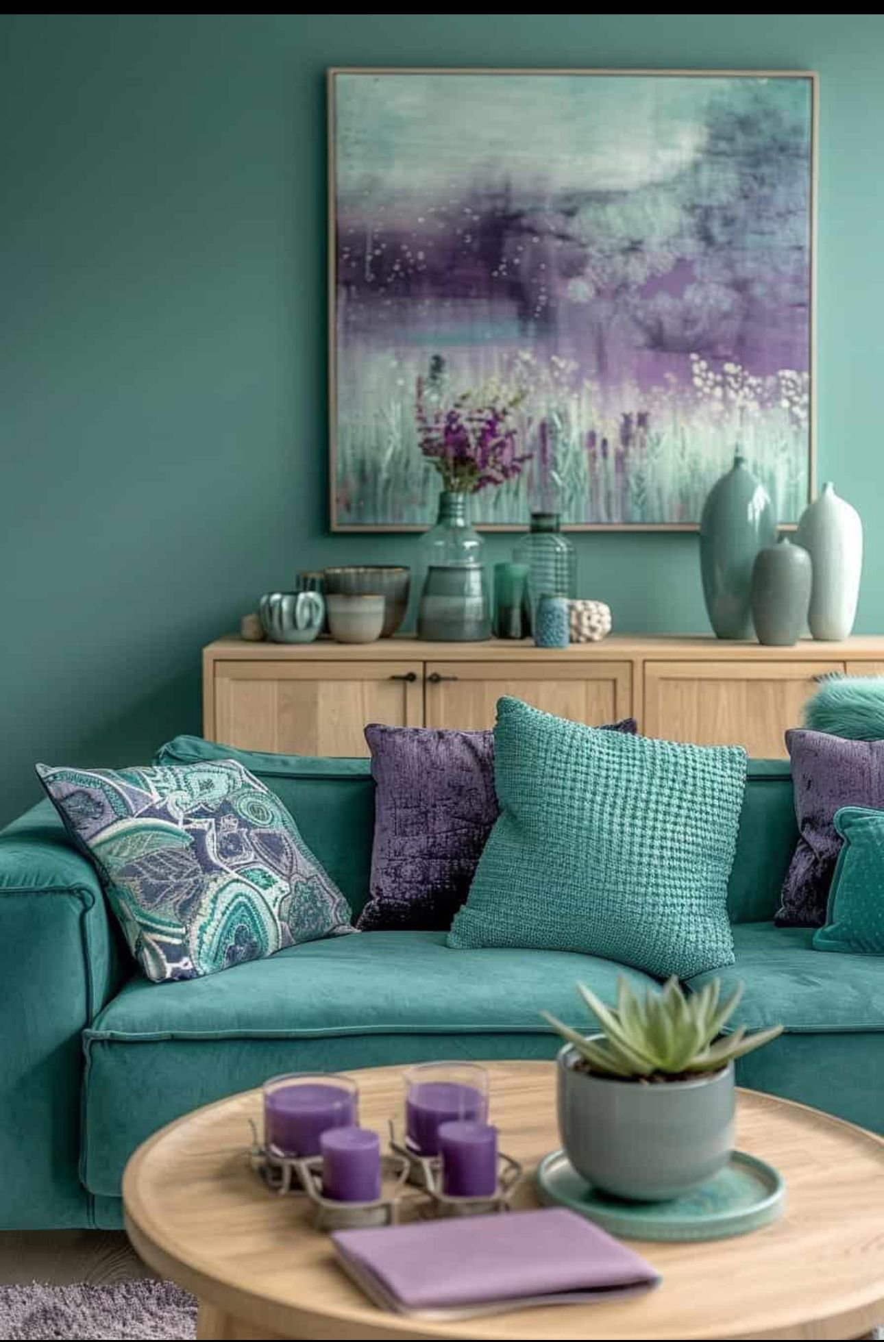
12. Timeless Navy: A Classic Contrast
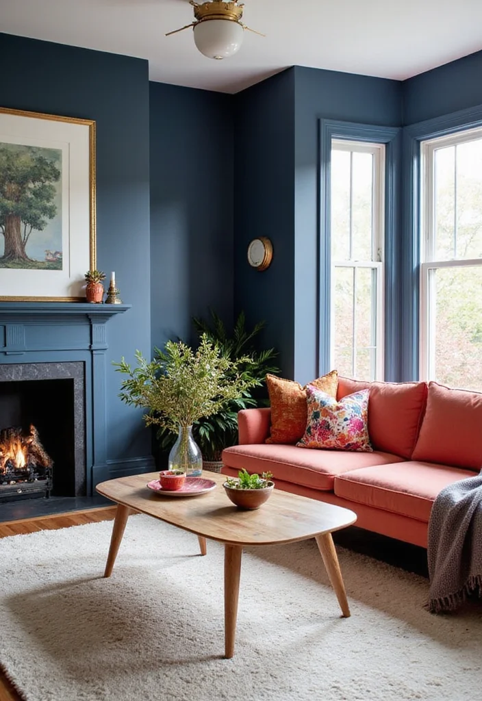
Navy blue is a classic color that can bring depth and elegance to your home decor. While it may not be the traditional ‘spring’ color, navy works wonders when paired with brighter hues, creating a sophisticated contrast that feels both timeless and modern. Picture an accent wall in navy or bold navy furniture pieces that anchor a room beautifully, adding a touch of refinement to your space.
To effectively use navy, consider pairing it with coral or peach for a fresh spring look. Introducing lighter colors like cream or beige can help balance the overall palette, maintaining a cohesive feel. Navy also acts as a versatile neutral, so don’t hesitate to use it in unexpected ways throughout your home.
Here are some suggestions for using navy:
– Pair with coral or peach for a fresh spring look.
– Introduce lighter colors like cream for balance.
– Use navy as a versatile neutral throughout your decor.
– Consider navy patterned rugs or curtains for interest.
This sophisticated approach creates a refined atmosphere, where classic colors work harmoniously together.
13. Lush Forest Green: Rich and Invigorating
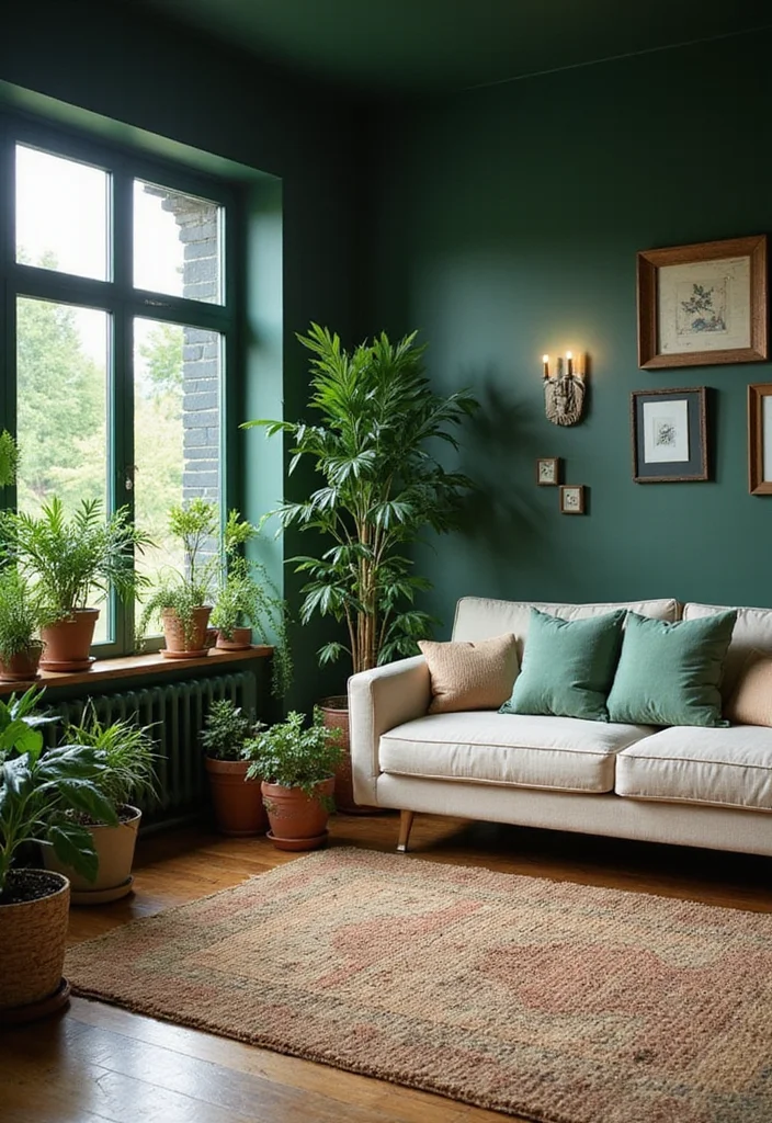
Forest green is a lush, rich color that brings nature indoors, imbuing your space with a vibrant yet cozy atmosphere. This deep shade is perfect for creating inviting environments, ideal for living rooms or reading nooks. Picture forest green accent walls or accessories that beautifully contrast with lighter shades, like creams and soft oranges, striking a balanced and harmonious look.
To incorporate forest green thoughtfully, consider using it on an accent wall for a dramatic effect or adding cushions and vases in this rich hue for a bold statement. Combining forest green with natural wood elements can enhance the organic feel of your decor. Be mindful, as darker greens may make smaller spaces feel enclosed, so use them strategically.
Here are some ideas for using forest green:
– Use on an accent wall for a dramatic effect.
– Add cushions or vases for bold statements.
– Combine with natural wood elements for an organic feel.
– Use thoughtfully in small spaces to prevent enclosure.
This approach creates a cozy and inviting atmosphere, where rich colors and textures interplay beautifully.
14. Serene Cream: A Neutral Essential
Cream is a timeless neutral color that effortlessly blends with any spring palette, adding warmth and light without feeling harsh. This soft hue is perfect for wall colors, furniture, or accents, providing versatility and balance in your home. Cream pairs beautifully with all the colors on this list, offering a calming backdrop that enhances the overall aesthetic.
To use cream effectively, consider it as a base color in rooms to create an airy feel. Combining cream with deeper shades like navy or forest green can provide striking contrast while maintaining a cohesive look. Incorporating cream in decor elements like curtains or rugs softens the overall appearance and invites a sense of tranquility.
Here are some tips for using cream:
– Use as a base color for an airy feel.
– Combine with deeper shades for striking contrast.
– Incorporate in decor elements like curtains for softness.
– Avoid too much contrast to maintain calmness.
This gentle approach creates a serene and cohesive environment, where soft colors and textures blend beautifully.
15. Elegant Charcoal: Sophisticated Depth
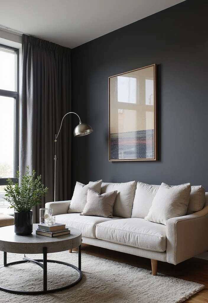
Charcoal gray is a powerful spring color that adds sophistication and depth to your decor. While darker than traditional spring shades, charcoal provides a chic backdrop that allows lighter colors to shine. Imagine using charcoal as an accent in furniture or accessories, creating a striking contrast that enhances your space’s overall appeal.
To incorporate charcoal effectively, use it as an accent color to add depth and richness to your decor. Pairing it with bright whites or pastels can create a stunning visual contrast that feels modern and inviting. Charcoal is versatile, working well in both minimalist and eclectic settings, making it a valuable addition to your design palette.
Here are some ideas for incorporating charcoal:
– Use as an accent color in furniture or accessories for depth.
– Pair with bright whites or pastels for striking contrast.
– Embrace its versatility in minimalist or eclectic settings.
– Consider charcoal textiles like rugs or curtains for texture.
This thoughtful use of charcoal enhances your decor, creating a sophisticated and inviting atmosphere where colors and textures complement each other beautifully.
Conclusion
Spring colors have an incredible ability to transform your home into a fresh, vibrant space that reflects the season.
Whether you go bold with fuchsia or keep it serene with soft lavender, the right colors can breathe life into your decor.
Consider these 15 stunning shades as inspiration to refresh your home, creating a space that feels inviting and uplifting during this beautiful season.
Note: We aim to provide accurate product links, but some may occasionally expire or become unavailable. If this happens, please search directly on Amazon for the product or a suitable alternative.
This post contains Amazon affiliate links, meaning we may earn a small commission if you purchase through our links, at no extra cost to you.
Frequently Asked Questions
What are the must-have spring colors to refresh your home decor this season?
Spring colors like soft greens, airy blues, blush pinks, sunny yellows, and lavender can instantly lift a space. To use them in interior design:
1) Choose one spring color as your main accent (on a wall, sofa, or large textile) to anchor the room.
2) Pair it with neutral bases (creams, beiges, stone) to keep the look calm and cohesive.
3) Layer the color through textiles, curtains, rugs, and artwork for an easy refresh.
4) Bring in fresh life with plants and seasonal florals.
5) Consider lighting—cool daylight vs warm bulbs can dramatically change the vibe of spring colors.
How can I incorporate spring colors into interior design on a budget?
You don’t need a full overhaul to refresh with spring colors. Start with textiles and accessories: throw pillows, blankets, curtains, and rugs in soft greens, blues, pinks, or yellows. Then add an accent wall with budget-friendly paint or peel-and-stick wallpaper. Swap decor like vases, artwork, and lamps in your chosen spring colors. Refinish or update hardware on furniture to echo the palette, and fill the room with plants for natural color and texture. This approach keeps interior design affordable while delivering a vibrant spring colors refresh.
Which color pairings are a game-changer for spring-inspired interior design?
A game-changing approach is pairing a vibrant spring color with a calm neutral, like warm white or taupe, to create instant balance. You can also try a tonal, monochrome route by using multiple shades of one spring color. Practical tips: build a mood board, test swatches in natural light, and balance bold color with textures (linen, wood, ceramic) so the space feels cohesive and inviting. This is a powerful way to refresh your room using spring colors without overwhelming the design.
How can spring colors influence mood and space feel in interior design?
Color can change how a room feels almost instantly. Gentle greens and blues promote calm, pinks add warmth, and yellows energize a space. To maximize mood: use lighter, tinted whites as a backdrop, layer color with natural materials (wood, rattan, stone), and assign color by function (calm areas like bedrooms vs. lively kitchens). Regularly preview lighting at different times of day, and keep a balanced mix of color and neutrals for a harmonious interior design that supports daily living.
What are quick ways to refresh a room using spring colors without repainting walls?
Focus on non-permanent updates that deliver a big impact: swap in new textiles (pillows, throws, curtains), add a colorful rug, and update artwork or decorative vases in your chosen spring palette. Bring in color through plants or seasonal florals for natural accents. Consider peel-and-stick wallpaper or a removable wall decal on an accent wall if you want a bolder change without full repainting. Rotate accessories monthly to keep the refresh feeling alive and aligned with spring colors.
Related Topics
spring colors
home decor
interior design
color trends
seasonal refresh
DIY decor
easy updates
vibrant palettes
modern style
budget friendly
transform your space
beginner friendly


Did you know that certain colors can actually affect your mood? For example, blue can make you feel more relaxed. It’s crazy how something as simple as paint can change how you feel in your own home!