You want your home to feel warm and inviting. Choosing the right colors can be tough. It sets the mood for every room. Check out this list of popular home decor color schemes to find what works for you.
How to Use This List
To make the most of this list, start by identifying your style. Look through the categories to find colors that resonate with you.
Next, consider the mood you want to create in each room. Some colors promote calmness, while others energize a space. Choose accordingly.
Once you have a few options, test them out with paint samples or fabric swatches. Place them in the room to see how they interact with your furniture and lighting.
Finally, mix and match colors from different categories. Don’t be afraid to combine shades for a unique look. This can add depth and personality to your decor.
Quick Stats
📊 Quick Stats
Total Items: 102
Categories: 6
Most Popular: Black and White
Most Unique: Turquoise and Coral
Expert Tips
Choose a Neutral Base: Start with a neutral color for walls and larger furniture. This creates a calming backdrop and allows you to add pops of color easily.
Use a Color Wheel: Refer to a color wheel for complementary colors. This ensures your chosen colors work well together, creating a visually appealing space.
Limit Your Palette: Stick to three to five colors in your scheme. This prevents the decor from feeling chaotic and gives your home a cohesive look.
Add Accent Colors: Incorporate one or two bold accent colors through accessories. This adds interest and allows you to change the mood without a complete overhaul.
Consider Lighting: Test colors in different lighting conditions. Natural and artificial light can change how colors appear, ensuring you love your choices at any time of day.
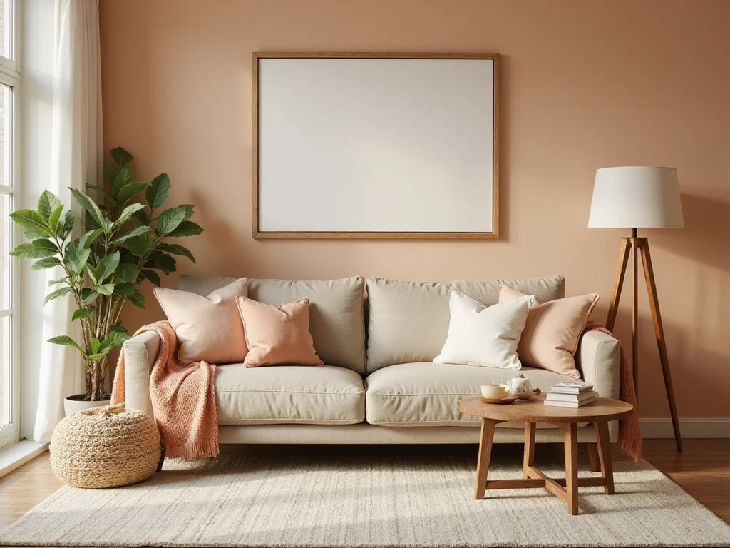
Neutral Tones
Timeless and versatile, neutral tones create a calming atmosphere.
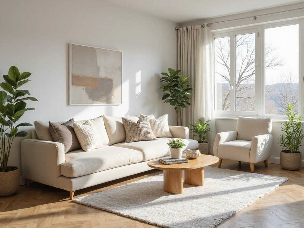
Beige and Cream
Soft and warm, this combination suits any setting.
Classic and adaptable.
Greige
A blend of gray and beige, perfect for modern homes.
Trendy and sophisticated.
Taupe
A rich, warm neutral that pairs well with bold accents.
Earthy and inviting.
Charcoal and White
Striking yet simple, this combo adds depth.
Bold yet neutral.
Sandstone
Inspired by nature, works well with wood textures.
Natural and grounded.
Ivory and Stone
Elegant and understated, ideal for a chic look.
Sophisticated and subtle.
Dove Gray
Soft gray that provides a modern feel.
Contemporary and cool.
Pewter
A darker gray for a sleek, industrial vibe.
Modern and edgy.
Off-White
Perfect backdrop for any style, lightens up rooms.
Versatile and bright.
Smoky Quartz
Adds a touch of warmth to grays and whites.
Warm and inviting.
Warm Gray
A cozy option for living spaces and bedrooms.
Comfortable and stylish.
Mushroom
An earthy tone that pairs well with greens.
Natural and calming.
Alabaster
A soft white that enhances light and space.
Bright and airy.
Ash Gray
Cool and contemporary, perfect for minimalists.
Sleek and modern.
Linen
Timeless and elegant, works with classic decor.
Traditional and refined.
Putty
Muted and natural, ideal for a subtle backdrop.
Soft and understated.
Clay
Warm and earthy, adds depth to neutral palettes.
Rich and grounding.
Bold and Vibrant
Energetic colors that make a statement.
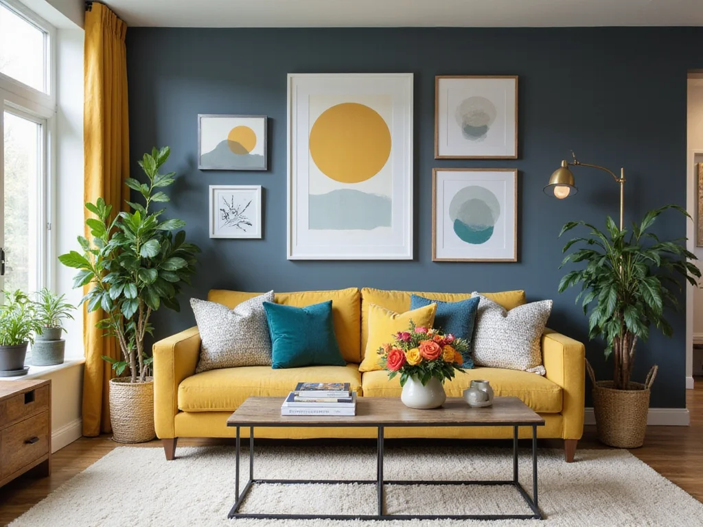
Turquoise and Coral
Vibrant and tropical, brings a beachy feel.
Fun and lively.
Navy and Gold
Luxurious and rich, perfect for a sophisticated look.
Regal and elegant.
Emerald and Ruby
Jewel tones that create a dramatic effect.
Bold and opulent.
Saffron and Teal
Adds warmth and depth, with a hint of bohemian flair.
Warm and exotic.
Fuchsia and Lime
Creates a playful and energetic environment.
Bright and cheerful.
Cobalt and Tangerine
A dynamic duo that catches the eye.
Vivid and striking.
Magenta and Cyan
Bold and modern, great for contemporary spaces.
Fresh and daring.
Cherry Red and Charcoal
Adds a pop of color with a touch of sophistication.
Dramatic and sleek.
Violet and Mustard
A unique combination that adds warmth and intrigue.
Distinctive and warm.
Indigo and Sunshine Yellow
Brightens up space while adding depth.
Cheerful and deep.
Electric Blue and Silver
Adds a modern, high-energy vibe.
Futuristic and bold.
Crimson and Gold
Rich and inviting, perfect for luxurious settings.
Opulent and warm.
Olive and Burgundy
Earthy and rich, evokes a cozy atmosphere.
Warm and inviting.
Aqua and Rose
Soft yet vibrant, ideal for romantic settings.
Gentle and lively.
Mint and Peach
Fresh and playful, perfect for spring decor.
Light and airy.
Plum and Gold
Rich and luxurious, adds a regal touch.
Elegant and plush.
Coral and Navy
Balanced and lively, suitable for nautical themes.
Bold and balanced.
Earthy and Natural
Inspired by the colors of nature, these schemes bring the outdoors in.
Forest Green and Oak
Creates a serene, woodland feel.
Natural and restful.
Terracotta and Sage
Warm and earthy, perfect for rustic decor.
Earthy and comfortable.
Sand and Driftwood
Evokes a coastal feel, with calming neutrals.
Relaxing and natural.
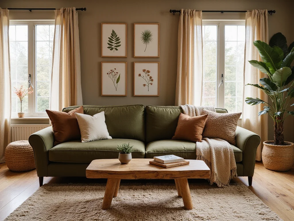
Olive and Rust
Rich and warm, suitable for fall-inspired decor.
Warm and seasonal.
Moss and Stone
Soothing and grounded, ideal for zen spaces.
Calm and natural.
Clay and Sky Blue
A natural pairing inspired by earth and sky.
Harmonious and balanced.
Bark and Leaf
Brings the beauty of a forest indoors.
Organic and lush.
Seashell and Coral
Perfect for beach-inspired themes.
Coastal and fresh.
Ochre and Sand
Warm and inviting, suitable for casual spaces.
Comfortable and warm.
Linen and Wheat
Soft and neutral, ideal for a farmhouse look.
Rustic and cozy.
Sienna and Olive
Earthy and rich, adds depth to any room.
Bold and natural.
Slate and Fern
Cool and fresh, perfect for modern layouts.
Contemporary and calming.
Pebble and Moss
Brings a touch of tranquility indoors.
Peaceful and natural.
Amber and Olive
Warm and organic, adds a touch of elegance.
Sophisticated and earthy.
Cedar and Pine
Rich and woody, perfect for cabin-style homes.
Warm and rustic.
Coral and Sand
Soft and serene, ideal for coastal aesthetics.
Beachy and bright.
Espresso and Sage
Deep and natural, suited for cozy environments.
Inviting and earthy.
Pastels
Soft and soothing, pastels bring a gentle touch to decor.
Lavender and Mint
Calming and fresh, great for relaxation spaces.
Cool and soothing.
Baby Blue and Peach
Soft and cheerful, ideal for nurseries.
Gentle and sweet.
Blush Pink and Dove Gray
Romantic and soft, perfect for bedrooms.
Elegant and serene.
Buttercream and Sky Blue
Light and airy, brightens up any space.
Bright and cheerful.
Pale Yellow and Lilac
Sunny and soft, adds warmth to rooms.
Warm and gentle.
Mint and Coral
Fresh and lively, brings a spring vibe indoors.
Vibrant and soft.
Soft Peach and Sage
Earthy pastels that soothe the senses.
Natural and calming.
Powder Blue and Lavender
Creates a tranquil atmosphere.
Calm and refreshing.
Rose and Cream
Delicate and romantic, suitable for vintage themes.
Charming and soft.
Periwinkle and Pale Yellow
Light and cheerful, ideal for brightening spaces.
Joyful and light.
Dusty Rose and Mint
Soft and inviting, perfect for cozy corners.
Warm and gentle.
Seafoam and Peach
Cool and refreshing, adds a beachy feel.
Fresh and breezy.
Pistachio and Blush
Subtle and sweet, creates a relaxing environment.
Calm and gentle.
Melon and Powder Blue
Soft yet vibrant, brightens up decor.
Cheerful and soft.
Lilac and Cream
Soft and sophisticated, perfect for a serene look.
Elegant and calming.
Ivory and Baby Blue
Light and soothing, adds a touch of freshness.
Fresh and airy.
Light Pink and Sky Blue
Gentle and calming, ideal for serene spaces.
Peaceful and soft.
Monochromatic
Single color schemes that focus on varying shades and tints.
Shades of Gray
Modern and sleek, adds sophistication to any room.
Timeless and versatile.
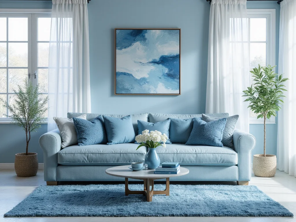
Blues
Calm and cool, perfect for creating serene environments.
Peaceful and soothing.
Greens
Earthy and refreshing, brings the outdoors in.
Natural and calming.
Reds
Bold and energetic, adds warmth to spaces.
Vibrant and warm.
Purples
Luxurious and mysterious, adds depth to decor.
Rich and elegant.
Yellows
Bright and cheerful, energizes any room.
Sunny and warm.
Whites
Pure and clean, creates a fresh look.
Bright and open.
Blacks
Dramatic and bold, makes a statement.
Sophisticated and edgy.
Beiges
Warm and neutral, suits any decor style.
Versatile and classic.
Browns
Rich and grounding, adds warmth and comfort.
Earthy and inviting.
Oranges
Vibrant and lively, great for energizing spaces.
Warm and bright.
Pinks
Soft and romantic, creates a gentle ambiance.
Sweet and calming.
Turquoises
Fresh and vibrant, adds a splash of color.
Bright and refreshing.
Golds
Luxurious and warm, adds a touch of opulence.
Rich and lavish.
Silvers
Cool and modern, adds sleekness to decor.
Contemporary and chic.
Copper
Warm and metallic, adds a rustic touch.
Rich and earthy.
Ivories
Soft and elegant, perfect for classic themes.
Timeless and refined.
Contrasting Pairs
Bold combinations that create striking visuals.
Black and White
Timeless and classic, ideal for modern decor.
Chic and sophisticated.
Blue and Orange
Energetic and bold, adds vibrancy to any space.
Dynamic and vibrant.
Red and Green
Festive and traditional, perfect for seasonal decor.
Classic and celebratory.
Yellow and Purple
Striking and bold, ideal for eclectic spaces.
Vivid and unique.
Pink and Green
Playful and fresh, adds a touch of whimsy.
Fun and lively.
Orange and Blue
Vivid and dynamic, creates a lively environment.
Bright and energetic.
Navy and White
Crisp and clean, perfect for nautical themes.
Classic and fresh.
Gold and Black
Luxurious and bold, adds a touch of glamour.
Sophisticated and rich.
Teal and Mustard
Retro and vibrant, adds character to spaces.
Distinctive and bold.
Maroon and Cream
Rich and warm, creates a cozy atmosphere.
Comfortable and elegant.
Turquoise and Red
Bold and exotic, adds a touch of excitement.
Vibrant and striking.
Cyan and Magenta
Bright and playful, ideal for creative spaces.
Fun and bold.
Emerald and Peach
Elegant and fresh, adds a touch of sophistication.
Chic and refreshing.
Burgundy and Gold
Rich and opulent, perfect for luxurious settings.
Regal and warm.
Plum and Silver
Sophisticated and cool, adds depth to decor.
Elegant and modern.
Coral and Mint
Bright and fresh, perfect for spring themes.
Lively and soft.
Navy and Yellow
Bold and cheerful, creates a striking contrast.
Vivid and bright.
Editor’s Picks
Soft Neutrals: We absolutely love this because it creates a calming and inviting atmosphere. Think soft beiges, creams, and light grays that blend beautifully with almost any furniture style.
Bold Jewel Tones: We highly recommend this because it adds a touch of luxury and drama to any space. Rich emerald greens, deep blues, and vibrant purples make a statement and are perfect for accent pieces.
Black and White: This stands out because of its timeless elegance. The classic contrast works in both modern and traditional settings, making your decor feel striking and sophisticated.
Earthy Tones: This deserves a mention because it connects your home to nature. Warm browns, muted greens, and terracotta hues create a cozy, grounded feeling that’s perfect for a relaxed vibe.
Pastel Palette: You’ll appreciate this because it brings a fresh and airy feel to your home. Soft pinks, light blues, and gentle yellows can brighten up a room without overwhelming it.
Monochromatic Scheme: We picked this because it creates a cohesive and polished look. Sticking to varying shades of one color can make a small space feel larger while highlighting texture and form.
Frequently Asked Questions
What are some popular color schemes for home decor? Neutral tones like beige and gray, earthy greens and browns, bold blues and yellows, and soft pastels are all popular choices that can create different moods and styles.
Why is a monochromatic color scheme effective? A monochromatic scheme creates a cohesive look by using varying shades of a single color, making spaces feel calm and unified.
How do I choose a color scheme for a small room? Lighter colors, like soft whites or pale blues, can make a small room feel larger and more open, while darker colors add depth and coziness when used strategically.
What color schemes work well for a cozy living room? Warm colors like rust, deep red, and warm neutrals can create a welcoming atmosphere, perfect for relaxation and socializing.
Why should I consider seasonal color schemes? Seasonal schemes allow you to refresh your decor throughout the year, keeping your space feeling vibrant and aligned with nature’s changes.
How can I incorporate trendy colors without overwhelming my space? Use trendy colors as accents in pillows, artwork, or decor items, allowing for easy updates without committing to a full room overhaul.
What role do color schemes play in home value? Neutral and timeless color schemes appeal to a broader audience, making your home more marketable and enhancing its overall value.
Fun Facts
• Bold Neutrals: Did you know that using a combination of black, white, and gray can create a strikingly modern look while still feeling cozy and inviting?
• Earthy Tones: Here’s a fascinating detail: Incorporating shades of brown, green, and rust can evoke the calming essence of nature, making your home feel like a serene retreat.
• Pastel Paradise: You might be surprised to learn that soft pastel colors can not only brighten a space but also create a cheerful atmosphere that promotes relaxation and creativity!
• Monochromatic Magic: Surprisingly, sticking to different shades of a single color can add depth and sophistication to a room, making it feel more cohesive and stylish.
• Vibrant Accents: Fun fact: Adding bold pops of color as accents can dramatically change the mood of a room, transforming a dull space into an energizing haven!
Conclusion
With so many beautiful color schemes to choose from, it’s time to let your creativity shine! Trust your instincts and pick a palette that resonates with your style. Remember, your home is a reflection of you—embrace it! Now, gather your favorite colors and start transforming your space today!
This is so helpful! I once painted my bedroom a bright orange thinking it would energize me, but I ended up feeling like I was living in a giant fruit. What was I thinking? 😂
Great suggestions! Did you know that certain colors can actually affect your mood? Blue can make you feel calm, while yellow can boost your happiness. Just something to think about!